If you click on a link and make a purchase we may receive a small commission. Read our editorial policy.
How Absolute Batman wears its manga influence not just in the artwork, but down to the lettering & word balloons
The secret behind Absolute Batman’s manga-inspired look isn’t just the art—it’s in the lettering.


Popverse's top stories
- Marvel Studios picks Spider-Man: Brand New Day captain Stephen Wacker as new boss for Marvel Comics editorial
- The Amazing Digital Circus cast says bringing Jax back would ruin the story
- DC's Absolute Batman cartoon will be an "expansion" of the comic, says Scott Snyder
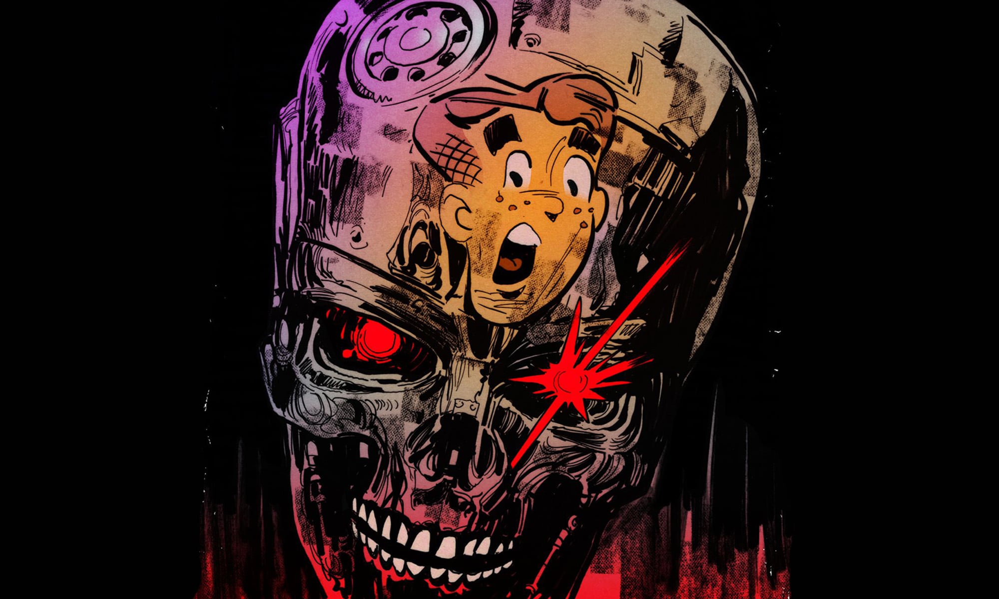
Much has been made about the manga influences in DC Comics' once-in-a-generation hit Absolute Batman, thanks to the linework of Nick Dragotta and the story of Scott Snyder... but that influence isn't just skin-deep, but it goes deeper inside the built-like-a-dumptruck Dark Knight and into his words and actions, as evoked by letterer Clayton Cowles.
"The first thing I noticed when I started Absolute Batman was the heavy manga influence in the artwork, so I got to work tailoring a lettering style to match using Adobe Illustrator,” Cowles says in Comics! The Magazine #1. “Most of the manga I read has the word balloons drawn into the artwork, so rather than using a ‘house’ style of world balloon (which are typically symmetrical ovals], I used a set of word balloons that looked asymmetrical and blobby (which I made myself)."

Cowles has been lettering for the past 17 years, on everything from long-running series like DC's Batman and Marvel's Daredevil, to creator-owned work such as Bitch Planet, Bitter Root, and Die. But in getting ready for Absolute Batman, Cowles broke with how Western superhero comics are traditionally done from head to tail, literally.
"I also opted to mainly use short balloon tails instead of the longer, curvier ones you see in Western superhero books, says Cowles. "From there, I whipped together a custom balloon stroke that matched the texture of Nick’s linework. I wanted this book to have its own, unique look, so I didn’t use any of the custom strokes I’d used before. This book was a new beginning, and it deserved something special."
While we all dabble in font choices, Cowles' encyclopedic knowledge of fonts led him to recommend a font that hasn't seen much use in superhero comics, despite him wishing it did.
"The first font I thought of when I got this job was a Blambot font called ActionFigure. It’s one I don’t use very much, but I wish I saw more of in the books I read," says Cowles. "It’s fun, kinetic, and lucky for us, compressed — because Absolute Batman has a lot of dialogue. Nick took a shine to ActionFigure, and the rest is history."
Another font that was key to Absolute Batman was the one to relay the voice of the narrator, Alfred.
“The other big lettering decision was to choose a style for Alfred’s narrative/log captions. I usually use a handwriting-looking font with a torn paper style for this kind of caption, and I colored the captions gray to match the color of Alfred’s hair," Cowles said, referring to the color choice by Dragotta and series colorist Frank Martin. "The font is Comicraft’s Omniscient, which I thought had a sophisticated flair to it — but not too sophisticated. This is a much grizzlier Alfred than the butler one, but he probably still went to posh schools and universities that emphasized good penmanship."
If there's ever one for an eye for good penmanship (and bad penmanship, when you need it), it's Clayton Cowles.
Here's an update to date guide on the Absolute Batman release schedule.
Follow Popverse for upcoming event coverage and news
Find out how we conduct our review by reading our review policy
Let Popverse be your tour guide through the wilderness of pop culture
Sign in and let us help you find your new favorite thing.


Comments
Want to join the discussion? Please activate your account first.
Visit Reedpop ID if you need to resend the confirmation email.